Sometimes parents look at their young adult children and see the adorable little baby that used to snuggle sweetly in their arms. Their child starts driving, going to college, living on their own; but their parent will always see them as the helpless little toddler they were years ago.
Website owners tend to do the same thing with their websites. When they look at their website they remember the day it first launched. It was modern, sleek, and the apple of their eye. Even if it has become outdated, difficult to use, and slow to load, they don’t consider that it’s time to let go.
It’s a good idea to occasionally take a step back and ask yourself if your website is really the best reflection of your brand that it can be. Trends change quickly, and if you want your site to keep up with the competition, occasional redesigns are a must.
Here are 8 telltale signs that your site is in need of a redesign.
1. It’s not responsive
Not only does non-responsive design diminish the user experience on your site, it can also harm your organic rankings.
Having a desktop and a mobile site isn’t enough anymore. You need a site that looks good and functions well on all screen sizes. Otherwise, your users and rankings could both be suffering.
When is that last time you looked at your website on your phone and/or tablet? Many website owners don’t think the check their website on the variety of devices that their viewers may be using. This means that issues (like users having to zoom to navigate your site) will go unnoticed.
2. It’s more than 5 years old
At the pace that technology and design progresses, it’s generally recommended that you update your site every 5 years.
In some industries this may seem like a long time, and in others that might actually sound like a short shelf life for a website. The actual timespan is industry specific, so you may be able to get away with a few more years.
However, if your site is older than 5 years, it may be a good time to look around at your competitors to make sure your site is keeping up.
3. You have a high drop-off rate in the middle of conversions
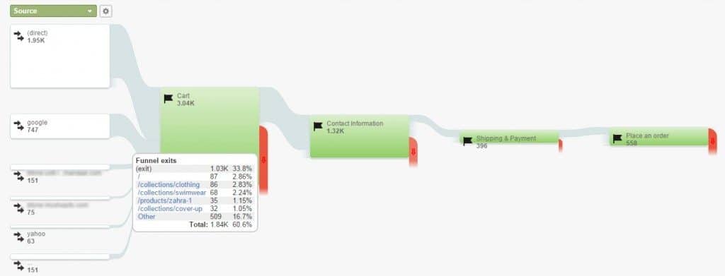
If your site has Goal conversions, you can use the Goal Flow report in Analytics to determine if there are steps in the conversion process where users are dropping off of looping back unexpectedly.

High drop-off or loop-back rates can indicate issues with the design of your website. Users could be getting lost or confused at a step in the conversion process and abandoning the conversion altogether.
You can use this data to determine whether the design of your website could be more simplified for your users.
4. Your site speed is poor
40% of web users abandon a site that takes longer than 3 seconds to load. Amazon found that for them, a 100-millisecond decrease in load time translated into a 1% increase in revenue. Google has announced site speed as a ranking factor in search results.
I can keep reeling off statistics, but I assume you’re convinced. If your site takes longer than 2-3 seconds to load, you should consider a redesign.
There are steps you can take before committing to a full redesign (like optimizing images and making sure that you have quality WordPress hosting). But the fastest sites are designed with speed in mind, not as an afterthought.
5. Your users are leaving fast
If your site has a high bounce rate, low time on site, and low average number of pages per visit, that’s a pretty strong indication that something is wrong.
Users aren’t liking what they’re seeing when they reach their site, and it’s in your best interest to find out exactly what that is.
It could be that your site is hard to read, hard to navigate, takes too long too load, looks outdated, or a number of other factors. An experienced company can help you identify the issue and suggest options to resolve it.
6. You can’t easily make updates
About 43% of all websites are built on WordPress (an incredibly user friendly CMS). If you can’t easily make minor updates to your website yourself, you might consider having your site rebuilt onto WordPress (or another comparable CMS).
In this era of AI blogging, it is crucial for website owners to have the ability to update their sites. With AI advancing rapidly, the capability to make timely changes to your website has become increasingly significant.
Whether it is updating content, adding new features, or optimizing for search engines, being able to adapt and evolve your online presence is essential for staying competitive.
Embracing the power of tools like ChatGPT or RightBlogger is essential to enhancing your website and will ensure that you can effectively engage with your audience.
With an experienced WordPress developer, you should be able to make most edits to your website yourself, without having to call a separate company and waiting for your request to go through.
7. It no longer reflects your brand
An evolving brand is a good thing. It represents a healthy, forward looking business. But your website needs to keep up.
If things like your logo, color scheme, service offerings, or core values have changed since your last site redesign, you’re probably due for another.
8. You’re not appealing to your target audience
If you have Google Analytics installed on your site (and you should), you can gain a lot of insight into who is visiting your site.
By enabling some additional tracking features, you can view the age, gender, and interests of your website users. You can use this information to determine if the demographics of your target audience matches that of your actual audience.
If they don’t, it’s possible that your website design is appealing to the wrong demographic and it may be time for a website design that it more appealing to your intended audience.
If your website has any of these issues, take some screenshots, stow them away in a photo album, and start thinking about a redesign.

